Imagery tends to appear differently than intended when displayed on certain AR displays…
Optical see-through AR displays superimpose virtual imagery over the user’s view of their physical surroundings. The Microsoft HoloLens and the Magic Leap are perhaps the most well known optical see-through displays, but more and more of these displays are beginning to become available to consumers.
These displays create imagery by adding light on top of what the user is currently looking at. The consequence of this is that the display cannot render anything that appears darker than the physical environment the user is looking at through the display. As a simple example of this, if you attempt to display black text on a white background, the black letters appear completely transparent (see bottom left image below). The color black is the absence of light, so the display cannot create black imagery without subtracting light from the user’s view of their environment.

This image illustrates how AR imagery intended to appear black is completely transparent when shown on the AR display. Notice that additionally, the white background on the left, and the white letters on the right seem to blend in with the brick texture behind them.
While this effect is most noticeable when attempting to display black imagery, a similar thing occurs for all colors shown on the display. In general, the darker a color is, the more transparent it will be when displayed on an optical see-through display.

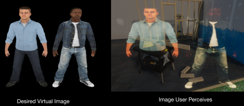
This image shows two virtual humans, as they are intended to appear (left) and as they would appear on an optical see-through AR display when the user is outdoors in bright sunlight (right). Notice that the lower half of the person on the left essentially disappears, and that it becomes difficult to see the facial expression of the person on the right.
The user’s environment partially determines the extent of this problem. If the user is in a very dark room, then imagery shown on the display will tend to appear more opaque and closer to the desired or intended appearance. Whereas if the user is outdoors in direct sunlight, imagery will tend to appear more transparent and “washed out.” This means that for any particular application on an optical see-through AR display, the user may be able to see all of the imagery easily when in a dark environment, but is suddenly unable to accurately distinguish the AR imagery when they face towards an exterior window or walk outdoors into bright sunlight.
Color Blending to Reduce Transparency
There is a technique known as color blending, that has been investigated as a potential solution to the problem of transparent AR imagery. With color blending, the AR system considers the color of the user’s physical environment behind each pixel in the AR imagery. It then calculates the color that would need to be added at each pixel position in order to create an image that, when blended with the user’s physical environment, best resembles the intended appearance of the AR imagery.
While this technique does help certain brighter regions of the AR imagery appear more opaque, there’s still the issue that the AR display cannot render colors that appear darker than the physical environment behind it. If any of these colors are used in the AR imagery, then the user will likely have difficulty distinguishing any visual features such as letters in a word, an indicator or notification icon, or even facial features on a virtual person.
If you are interested in learning more about color blending, I would recommend reading these papers:
- A Perceptual Color-Matching Method for Examining Color Blending in Augmented Reality Head-Up Display Graphics
- More than meets the eye: An engineering study to empirically examine the blending of real and virtual color spaces
The Underlying Issue: Contrast
If we take a step back and consider the human visual system, there are two basic measures that determine how easily we are able to see something. One is size, and one is contrast.
Starting with size, if the thing we are looking at is too small, then we may not be able to see it. Anyone who has visited an optometrist has likely experienced difficulty when attempting to read the smallest letters on the visual acuity chart. If you haven’t experienced this, then try reading the words below this line without zooming in.
You zoomed in, didn’t you…
Contrast is less intuitive compared to size, but is equally as important. Contrast measures a difference between the thing we are trying to see, the foreground or feature, and the area surrounding the thing, the background. As a simple example, when you are reading the words on this website, there are black letters on a white background. Contrast in this case, measures the difference between black and white, which is the highest contrast any display can typically achieve. If we were to use white letters on a white background, there is no difference between the letters and background, therefore the contrast is zero and we would be unable to see the letters or words. In general, the higher the contrast, the easier it is to see the feature or foreground you are looking at.

The top row in the image below demonstrates how contrast can change when changes are made to the background of the image, whereas the bottom row demonstrates how contrast can change when changes are made to the foreground.
Tying this back to AR imagery, size is not so much of an issue, as we can easily control how big the elements of the virtual scene appear to the user.
Contrast is trickier, as there are many different factors that determine the contrast between the AR imagery and the user’s environment behind it. There are also many different combinations of these factors that result in poor contrast, where the user may experience difficulty using the AR display.
As a part of my doctoral research, I demonstrated how to identify when the user is experiencing the worst cases of poor contrast, where they may not be able to see the AR imagery at all (effectively rendering the display useless). I also demonstrated that in less severe poor contrast scenarios, the user may be prone to misread text, miss important visual cues or notifications, or even misread the facial expressions of virtual humans.
What can be done?
Ideally, future optical see-through AR displays will constantly monitor the user’s environment and automatically adapt:
- AR Imagery: The color and brightness of the imagery being displayed
- Environment Light: The amount of light reaching the user’s eyes from their environment
If these two things can be controlled, then the AR system can maintain the contrast, and in general, the appearance of AR imagery as the user’s environment changes behind it. However, AR systems will need to understand how the changes they are making to the imagery or to the environment light will affect the user’s perception of the AR imagery.
What are we doing about it?
The main focus of my doctoral research was on establishing a contrast model specific to optical see-through AR displays. This model can be used to predict how changes made to parameters controlled by the AR system will affect the appearance of the AR imagery. As a part of this work, I created a simulator in Unity that allows us to visualize the appearance of AR imagery on different AR displays, in different environments, and in different lighting conditions. Most of this work is still under peer review, but if you have any questions about it feel free to reach out to me via email.