Light Mode vs. Dark Mode
Regardless of the display you are using, just about every application has a need to display text. Traditionally, we use black text on a white background, which has been previously shown to improve the legibility of the text being displayed. Lately, there has been a paradigm shift to where many applications offer a choice between light mode, typically black text on a white background, and dark mode, typically a black or otherwise dark background with white or light-colored text. Despite light mode user interfaces having advantages in terms of legibility, many users opt to use dark mode, some stating that it is less straining on the eyes, particularly when in relatively dim lighting conditions.
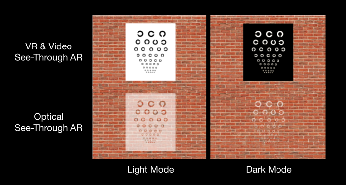
While the benefits and limitations of dark mode style UIs has been studied for more traditional displays such as flat-panel monitors and mobile devices, AR and VR displays are unique since the display is typically very close to the users eyes. Also, as described in the AR perception project, optical see-through AR displays like the HoloLens and Magic Leap cannot render black, which may affect the legibility of text for both dark mode and light mode style user interfaces. Because of this, the potential benefits and limitations of dark mode and light mode user interfaces should be evaluated specifically for AR and VR displays.

Light mode UIs (left) and dark mode UIs (right) as they may appear on VR and video see-through AR displays (top) and on optical see-through AR displays (bottom).
Optical See-Through AR Displays
We first compared these display styles on the Microsoft HoloLens 1, an optical see-through AR display. Our results suggested that:
- Dark mode user interfaces are more legible than light mode user interfaces
- The usability of dark mode user interfaces is higher than light mode user interfaces
- Visual comfort when using dark mode user interfaces is more comfortable than light mode user interfaces
In general, dark mode style user interfaces were found to be significantly better than light mode user interfaces in terms of visual comfort, legibility of text, and the usability of the user interface.
Guidelines for UI design:
Based on our results, we suggest using dark mode style user interfaces for all applications on optical see-through displays.
Light mode UIs (left) and dark mode UIs (right) shown on an optical see-through AR display.
VR and Video See-Through AR displays
VR displays and video see-through AR displays are similar in that the user’s view of their environment is occluded by the display. For VR displays, this allows us to feel present within a virtual world, whereas for video see-through AR displays, a camera view from the user’s perspective is shown on the display to allow the user to see their physical surroundings. You may have experienced video see-through AR if you have experienced the passthrough feature on the Meta VR displays.
We evaluated dark mode and light mode user interfaces on the Oculus Rift S, where we found results that were quite different from the previous study run on an optical see-through AR display. We found that:
- Text is more legible in dark mode when the scene lighting is dim
- Text is more legible in light mode when the scene lighting is bright
- The usability of dark mode user interfaces is similar to light mode user interfaces
- Visual comfort when using dark mode user interfaces is more comfortable than light mode user interfaces
In general, the best UI for job depended on the lighting conditions of the virtual scene. This result is similar to existing work on more traditional displays.
Guidelines for UI design:
Based on our results, we suggest using dark mode style user interfaces for virtual environments and scenes with relatively dim lighting conditions, and we suggest using light mode style user interfaces for virtual environments and scenes with relatively bright lighting conditions.
For More Information:
If you are interested in learning more about dark mode and light mode user interfaces on AR and VR displays, feel free to reach out to me via email. If you are interested in the publications that came out of these projects, below are several links.